I first noticed Croatian cartoonist Tonči Zonjić only recently, when his work appeared in the Image comic Zero, which is written by Ales Kot and drawn by a different artist every issue. Among quite an interesting and eclectic group of artists, Zonjić’s cover and interior art for Zero #9 stand out as informed and moving expressions of the effects of warfare on the country of his origin.
I contacted Zonjić online and began to correspond with him; meanwhile I began tracking down his previous work in various comics. I found an early smattering of superhero work for DC and Marvel and he just completed his third storyline for Dark Horse’s Lobster Johnson. Done with co-writers Mike Mignola and John Arcudi and colored and lettered by the usual highly effective Mignolaverse team of Dave Stewart and Clem Robins respectively, “The Burning Hand”, “Get the Lobster”, and the one-shot “Caput Mortuum” all display Zonjić’s classic comics sequencing and concise drawing.
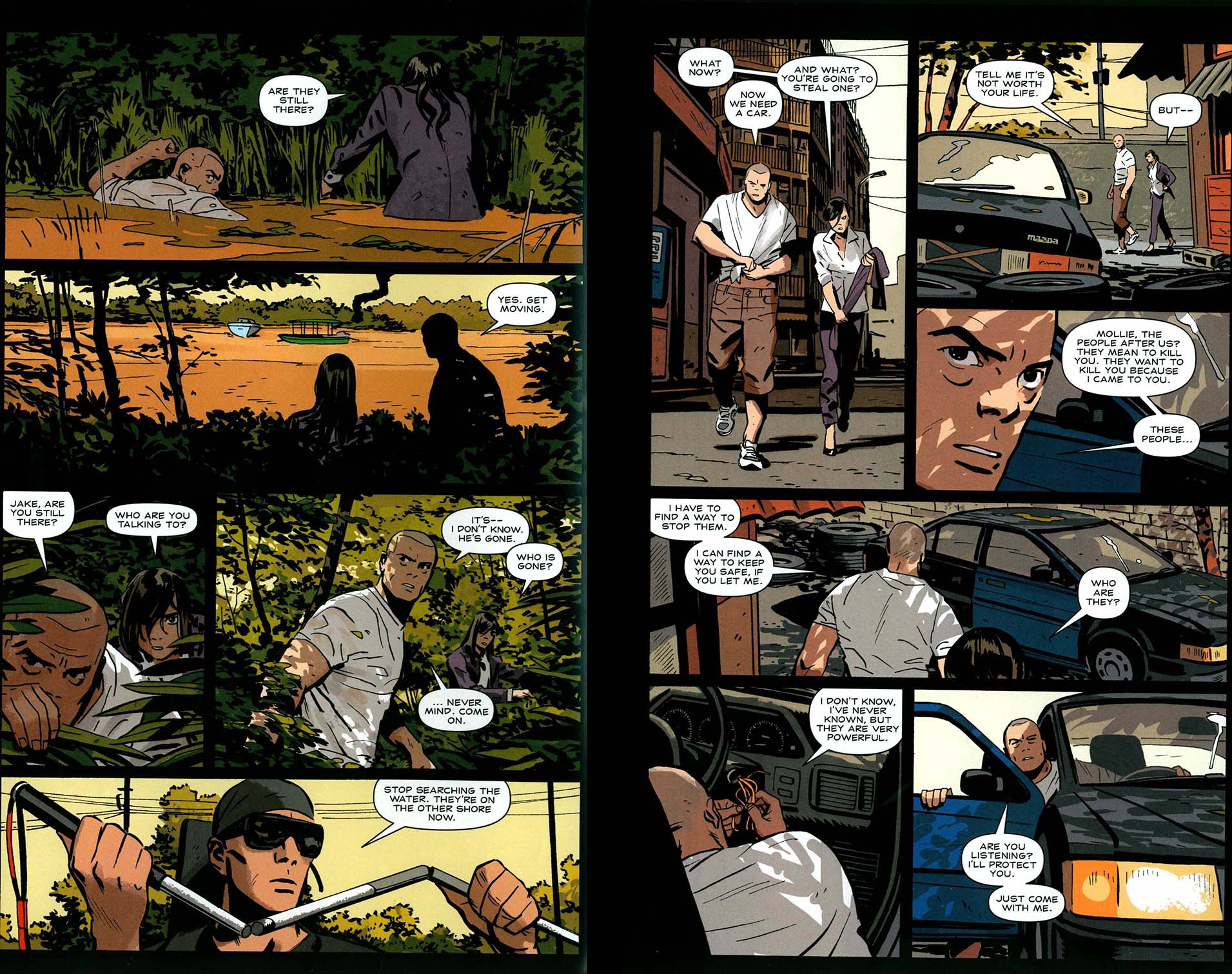
What really strikes me, though, is the elegant realism and assured, gripping storytelling of his two Image series with writer Nathan Edmondson about a renegade CIA analyst and his ghostly psychic remote-viewing guardian angel, Jake Ellis.
Edmondson/Zonjic from Where is Jake Ellis? #2
For these comics, Zonjić shows himself to be a rare bird indeed in the world of commercial comics, as he handles all of the visuals: pencils, inks, color and letters. In the first series, Who is Jake Ellis?, the cartoonist’s balanced, economical compositions remind me of nothing so much as the similarly effortless-appearing work of Alex Toth in his full-length Dell comics of the 1950s and early 1960s. In the second, the still-in-progress Where is Jake Ellis?,Zonjić punches up his attention to detail and uses a particularly rich color palette to make some of the most intense and coherently articulated action comics I have ever seen.
I interviewed the artist by email in the later months of 2014.
_________________________________________________________
James Romberger: Can you give me some biographical details; for instance when and where you were born, some data on your art training, art college, previous non-USA publications, non-comics artwork experience or gallery work even, etc?
Tonči Zonjić: I was born in 1986, and I finished a Natural Sciences High School. Math, basically. Back then, I’d wanted to study computer programming, and that was actually my primary activity (we even dabbled in robotics) up until high school. Then I discovered the world of digital art, and forums, and started drawing more.
I was in the concept art crowd, and for a short while that was a possibility. When I was 17, I was offered to move to the US and work in that industry. It was too big of a move and I didn’t end up going. Somewhere around that time I became more interested in comics. Friends got me some interesting US comics — everything from Miracleman to Authority to Seth Fisher comics. I saw Grendel Tales and Human Target.
Since it’s Croatia, the next step wasn’t thinking about a career in comics, so I got into the Graphics Arts College. Actually, I first applied to the Design College on the recommendation of the dean of the Fine Arts Academy. I went to meet him, and he saw my sketchbooks and said, “Design. You want to go there.” So I did, and I didn’t get in. I didn’t pass the minimum drawing test. Everyone I know laughed when they heard this. But it felt pretty bad, then. So I went to the other design place, the Graphics Arts college, and dropped out of that one after a year, because the only drawing we did were simple assignments, like drawing blocks, or rudimentary composition exercises, and all the rest was chemistry, math, and engineering.
After that I went to the Fine Arts Academy to study animation (painting seemed out of reach, and I was told it was impossible to get in). I wasn’t interested in animation much, but was expecting a lot of gesture drawing, because I saw online that’s what people generally do in animation schools. There turned out to be no gesture drawing at all, only a three-hour pose once a week, but we did learn the basics of animation. The animation branch was merged with conceptual arts and new media, so we saw a lot of conceptual art and video art and it drove us all a bit crazy. I was a terrible student, but I did actually learn a lot there, although it did take me six or seven years to realize it.
I went there for two years before becoming a full-time freelancer. I was just starting to do comics seriously, and the rest of the time I was drawing storyboards for TV ads, sometimes illustration.
I did an issue of a comic about diving that never got published. I submitted a design to repaint the local small particle accelerator, and won. I worked for the newspaper, drawing a weekly portrait for nearly four years. I did book covers. I attempted to do illustrations of chocolates that you see on the packaging – chocolate with rice, chocolate with almonds, and so on. I did a fanzine with some friends, which were first comics I did. I tried drawing a five-page story Darko Macan gave me, and did a very disappointing job, but started on Port Silver a few months later.
It’s funny because if you’d asked me what kind of art I had no interest in, I would’ve said animation, and caricature/portrait work, and at some point in 2007-2008 I was doing both.
Then came comics in a more serious way.
As a cartoonist myself I have to say that you really draw and tell comics stories beautifully–
Thanks for the kind words! I know your work, and like it a lot. Also, that Caniff article you wrote made me go look at his work again, and the timing was great for me to get really hooked on it.
I’m happy if that was the result. I only discovered Caniff’s stuff fairly recently myself, but it sure does read well! And there is a lot to learn there about hooking an audience with well-developed characters and settings.
My problems with Caniff were mostly that I found all the characters ugly – for years – and it was enough to put me off. Dumb, I know. Steve Canyon was the first I saw, not the best stuff. And it took about ten years to find the really good work of his, and me working in comics also helped, because it made me appreciate the sheer amount of work, and the level of it. The color Sundays were a turning point probably. And since he is always presented in a strange opposition to Noel Sickles, it helped that Terry and the Pirates is a great read, where I couldn’t get through more than two pages of (Sickles’) Scorchy Smith, however good the drawings. (Roy Crane tops both of them for me now, though.)
Beyond some equivalence of your work with that of other economical comics stylists like David Mazzucchelli, I notice some similarities to Alex Toth and Edvin Biukovic, also maybe Mike Zeck and Pete Morisi?
Edvin was the #1 influence on me starting out and I ended up even working on some of his uncompleted projects. Port Silver (with Darko Macan) was something he was about to do. There was also the script for the third Grendel Tales story that was offered to me. But that was quite a load to carry and I decided not to do it after a few years of consideration. Still, he was the first person that I could identify with; the total approach to work he had made sense to me. Toth too. The funny part is that the less I look at Toth’s work, the more people tell me mine looks like it. It’s the way of thinking, I guess. Haven’t read any Zeck or Morisi, though what I’ve seen of Morisi’s work looked appealing.
Did you know Biukovic personally?
No, I never met him. He died in 1999, and I discovered his work in 2000, when they released a hardcover edition of Citati (“Quotations”, with Darko Macan) a 48-page collection of short stories he did for the German market. That’s basically where I began thinking about comics as a possibility.
I was pleased to be printed with one of his stories in a Vertigo anthology (“Third Toe, Left Boot”, written by Bruce Jones in Strange Adventures #2, 1999) and I really responded to the humane feeling of his work. What a loss.
Ah, right — I remember your story. Eddy’s work there wasn’t colored very well, unfortunately, and didn’t have nearly the impact it should have had. The black and white pages look incredible. It was the penultimate story he did, and he was just about to make it to a whole new level…
Actually, Biukovic’s final Vertigo work was on a heartbreaking short piece with writer Darko Macan in a Weird War Tales one-shot.
He actually never finished that story – “A Prayer to the Sun” – his friends completed the unfinished panels afterwards.
In that and his series with Macan (collected in Grendel Tales: Devils and Deaths, 1996) he showed a real feeling for tragic war stories, I imagine due to what he saw happen around him in your country. But you do something different—you hit something that reminds me of Toth’s sweet spot between cartooning and realism, for example on his Dell work and the best of his DC Hot Wheels stories:
Toth art from “Eye of the Storm!” Hot Wheels #4
It’s a tough balance to hit, but nothing makes me happier than seeing that well done.
Again, you are just reminding me of bits of these guys… The Zeck work I was thinking of was a job he did on the double-sized Punisher #1 (1986) and as for Morisi, I’m thinking less of his more photo-referenced late stuff and more of his aggressive, early Toth-influenced work. Another influence I imagine that I see in your work is Michael Golden. I’m not sure if you like his stuff, but he certainly is a good example of someone who, like you, draws and colors very well indeed and his attention to detail, his rendering, the exactitude of his rendering of mechanical objects are incredible.
I haven’t read much of Michael Golden’s work. But his name does come up pretty quickly when you talk to older cartoonists about craft – you get the sense he is highly regarded for his approach. The funny part is that the actual craft part is what bothers me the most on every comic I do, so it’s weird to be compared to these people who are so much more patient than I am.
Because I’ll spend a lot of time working something out, storytelling-wise, and then mess it up in the actual drawing (usually because I’m out of time). So right now I’m working on that part, the “dumb, boring stuff,” like drawing ellipses right. I don’t know about other people, but I’m sure it’s the same. You start out by attempting things you can’t possibly achieve, obsess over someone’s brushwork, spend so much time trying to be interesting, and after a while you find yourself not thinking about any of that really, but just trying to do the really dumb stuff well like setting up volumes. That exercise they make you do at school, where you draw boxes and cylinders? Everybody hates that. I hated it so much, because I wanted to be drawing like Paul Pope! So I’m drawing boxes and cylinders now, ten years into this.
At any rate, my pointing out similarities to other artists is not to say that you don’t have your own style. You draw a wide range of physical types and your figures have weight, their gestures and acting are believable. Obviously your composition sense is nicely balanced and often quite elegant. Your work seems to me to really be about drawing, about making convincing movement on the page and moving things around in deep space.
I’m hoping to really expand my vocabulary now that I’m in Toronto. It’s very diverse, unlike Croatia. I commute to the RAID studio, so I use that time to observe and maybe sketch people.
In looking at your earlier work, Marvel’s Heralds (with Kathryn Immonen, 2010) mixes pages that are by you in with pages done by other artists. The trade paperback has no credits that indicate who did what. Maybe there were in the original comics?—but not in the collection. Now, I can guess for myself which pages you did in that book, the balance and grace of your drawings stand out. But the packaging gives the idea that the publishers don’t care—it suggests that they consider the artists to be interchangeable and expendable. Vertigo used to do a similar thing, assigning incompatible artists to odd pages within a single comic.
Heralds had a strange schedule — I think we started in December or January, and the book was planned to be released in July, all five issues. It was more than I could handle at that point, so other people had to come in to help out. It’s funny to think now of James Harren and Emma Rios “helping out”, because they both became huge stars since then. To me the book actually feels like four people drew it, because on the last issue I changed my inking from brush to a big fat marker.
My first job for Marvel was in fact the same kind of thing — they needed someone to jump in and do five pages of Iron Fist (#s 13 & 14, 2008 and #23, 2009). So it was David Aja, Kano and me. I couldn’t possibly ape any of those two back then, but on the next issue Stefano Gaudiano inked my pages, so that made the difference less jarring. I also did a few pages in an issue of Daredevil (#115, 2009) and did my best to make the pages look like Michael Lark. Again, Stefano’s inking helped to blend them in, and people didn’t seem to mind too much.
I notice you handle all aspects of the page: drawing, color and letters in your two excellent Jake Ellis series. I am wondering, are you adding an additional grey tone to the linework for the very polished art on the Lobster comics? The work has a more specific lighting than what I have seen in a lot of other coloring by Dave Stewart.
I haven’t been sending too much to Dave—he has a bushel of Eisner awards, so it seemed presumptuous to direct him too much. If I’m going for something specific, I’ll send the gray tones, but other than that there’s no need. I did send him some guides with shadows for faces that were tricky — that’s the one part that can be off, in a way that the shadows will change the expressions. Since the linework gets very reduced and simplified, it’d be crazy to expect Dave to read my mind on those. I also sent some guides for the most recent issue, where I tried doing the zeppelin explosion in a way Roy Crane would. Here are a few guides from this last book– sometimes I’ll type out some stuff, or send my layouts, which often have things separated with a single gray, like in the Image collection of Toth’s Zorro.
Tonci’s grey guides and Dave Stewart’s finished color pages
Stewart is obviously paying attention to what you are showing him. He’s a very effective colorist, but he doesn’t usually add distinct light sources like that and you are also able to specify details, like the running blood. Oh, I just got the trade paperback of “The Burning Hand” and saw your sketch section in the back, which mentions the toning in Crane and Sickles that really enhances their work. And Toth’s Zorro was helped a lot by his gray tone guides. I hope you have a bunch of Toth’s other Dell comics too… Clint and Mac, The Land Unknown, he did so many lovely, economical art jobs in the 1950s, early ’60s.
I read all of those on the Tothfans website — I religiously saved all of them as they were posting them, and spent countless hours looking at them. Later I got some on paper –“The Case of the Curious Classic”, “White Devil, Yellow Devil”, and a few others.
I can certainly see Toth and also Crane in the solid, symmetrical cast of your heroes’ faces, and in the remarkably clear compositions and elegant body language of even the most complex action scenes on your pages. I particularly like your Jake Ellis stuff, where you have total control. I like your own color very much.
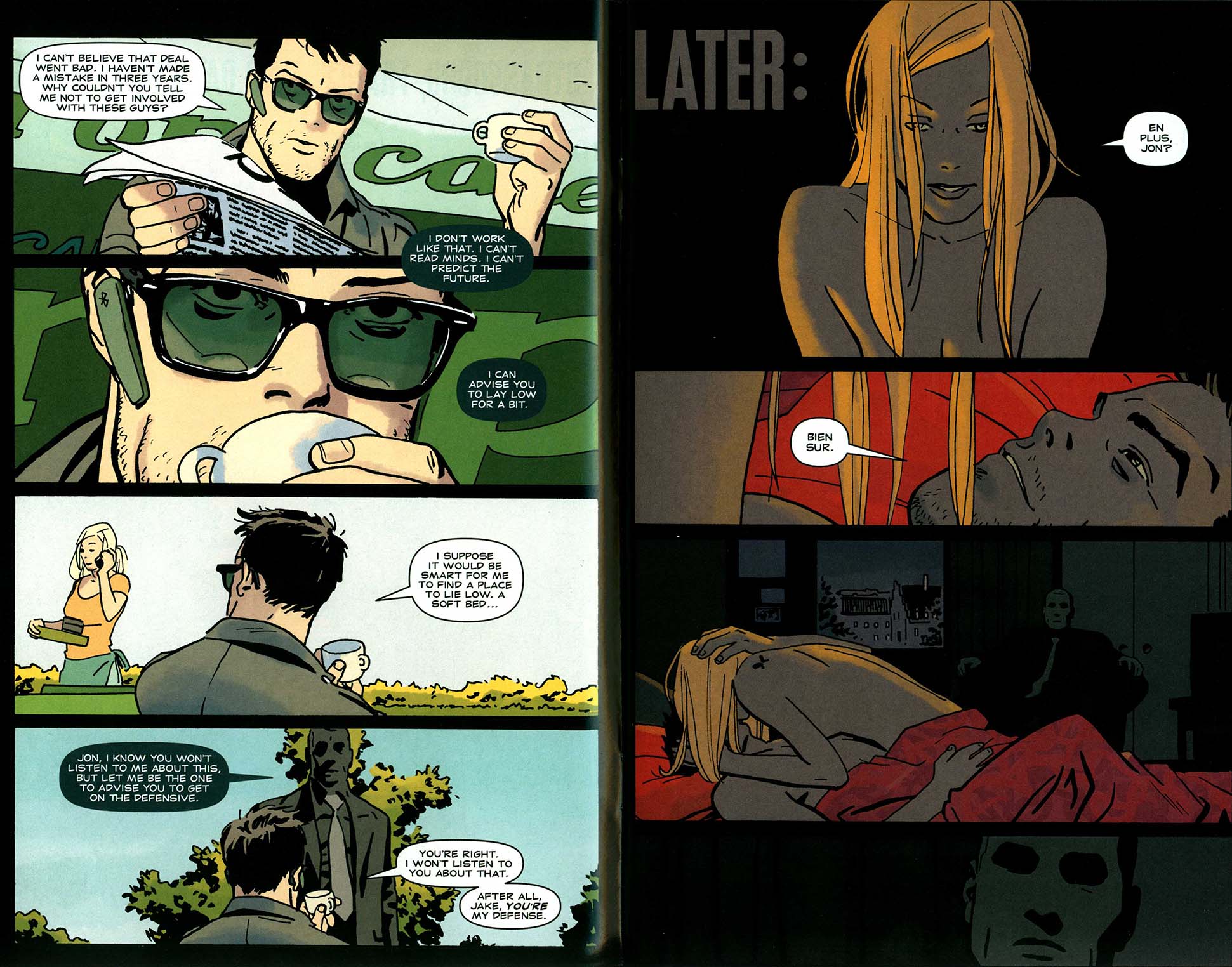
The voyeuristic guardian from Who is Jake Ellis? #1
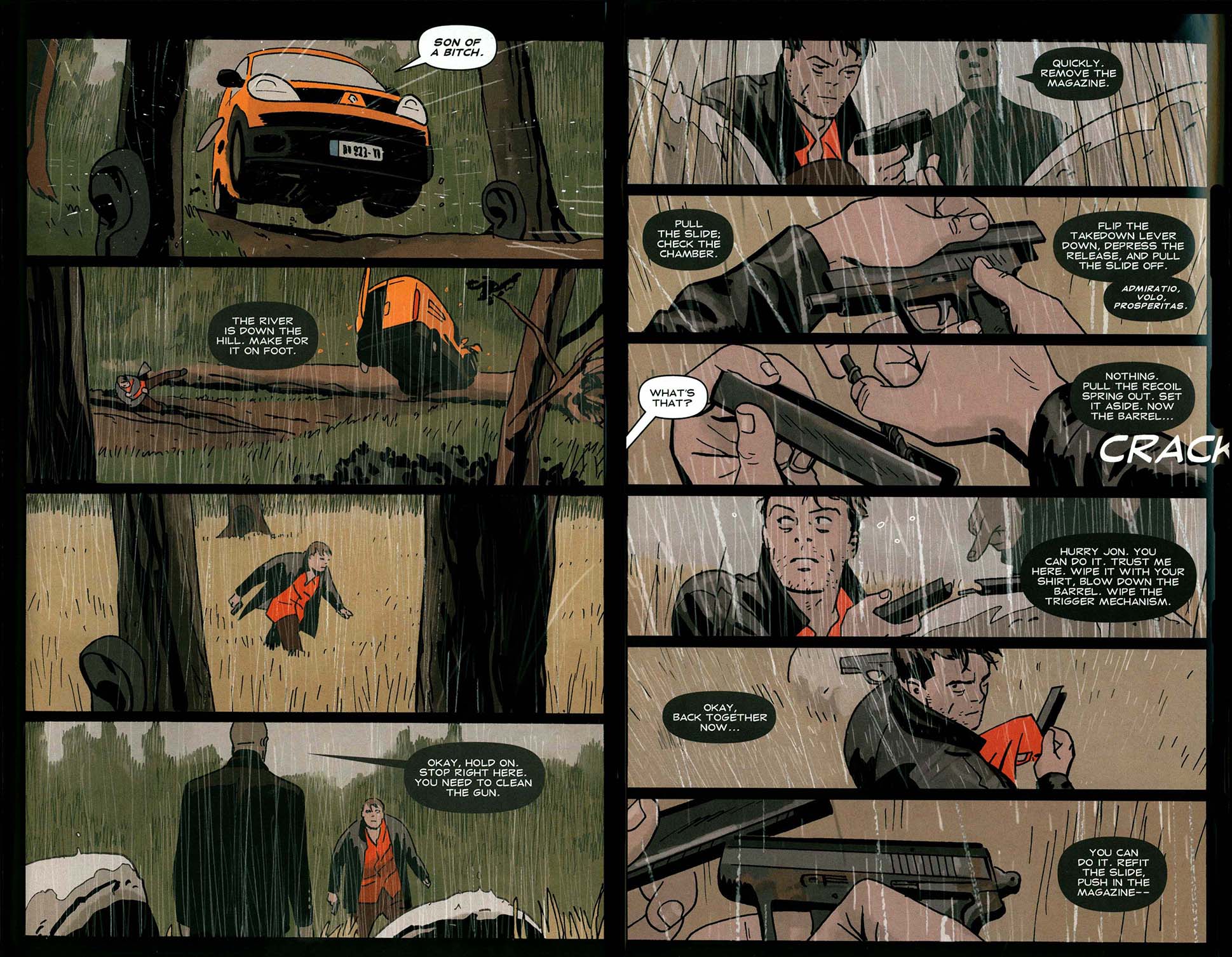
Gun cleaning in the rain from Who is Jake Ellis? #2
The first series is excellent and Where is…? is even better, more precise in the drawing. The art and coloring on the first three issues are phenomenal.
Thanks! Where #4 just came out a few weeks ago, and I’m in the middle of laying out #5. For this last one I’m just doing the layouts. As always, I’d prefer to color everything myself, but that’s probably not likely to happen anytime soon.
The action sequences (well, it’s ALL action sequences!) are really well-articulated and your color is incredible. I’d guess that the reason people are sweating you about the, shall we say, protracted time between issues is because they are so damn good—this is really state of the art stuff.
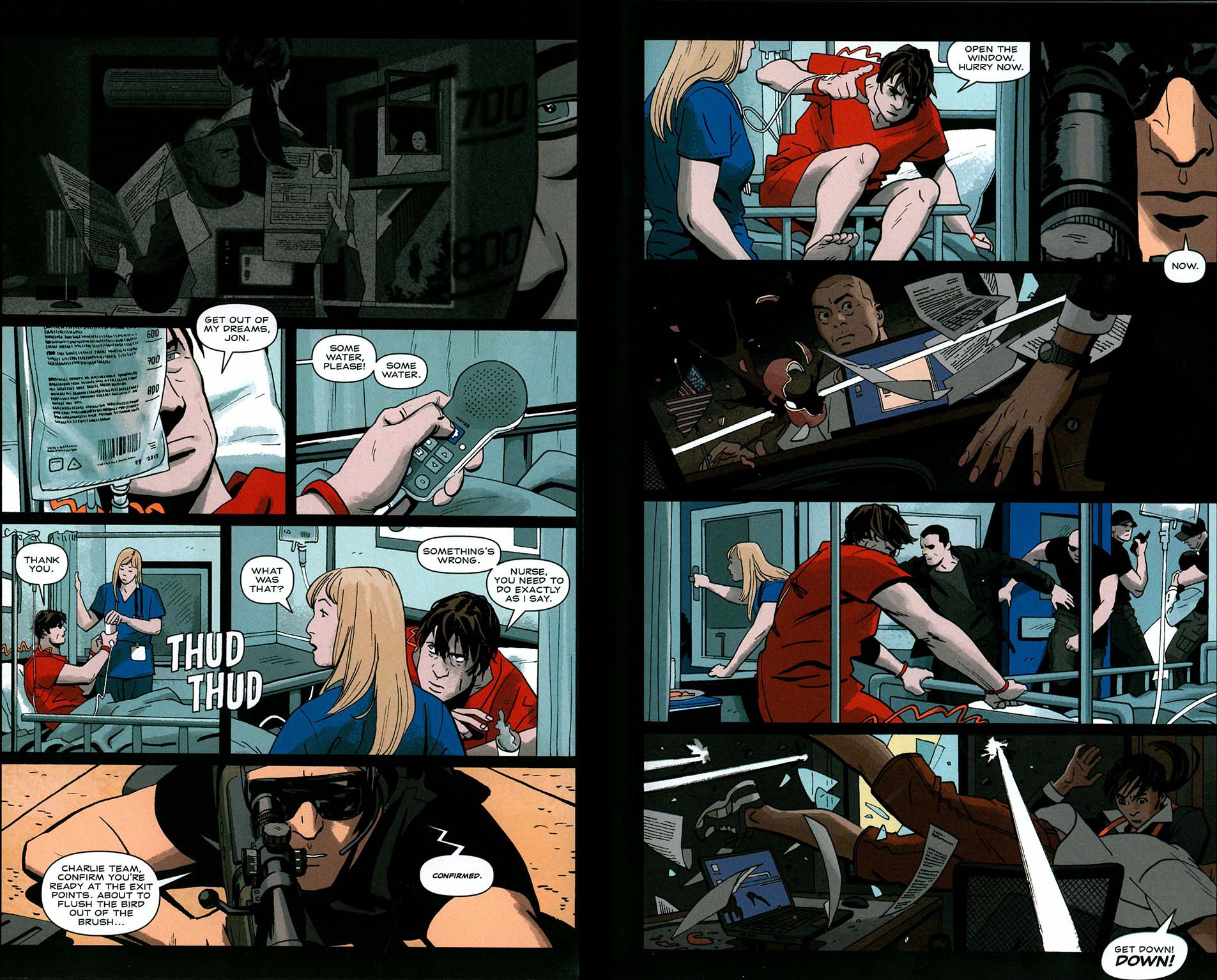
Violent action from Where is Jake Ellis? #1
The first issue you mention is now two years old, hard for me to look at! But thank you. It’s a more bombastic book visually, more space to go wild, but I believe that the discipline on Lobster is what’s making me grow more. Ellis is design, and Lobster is drawing. If that separation makes sense. Both useful, but on Lobster I push myself a lot more to do simple things as thoroughly as I can. Just to do simple, solid work.
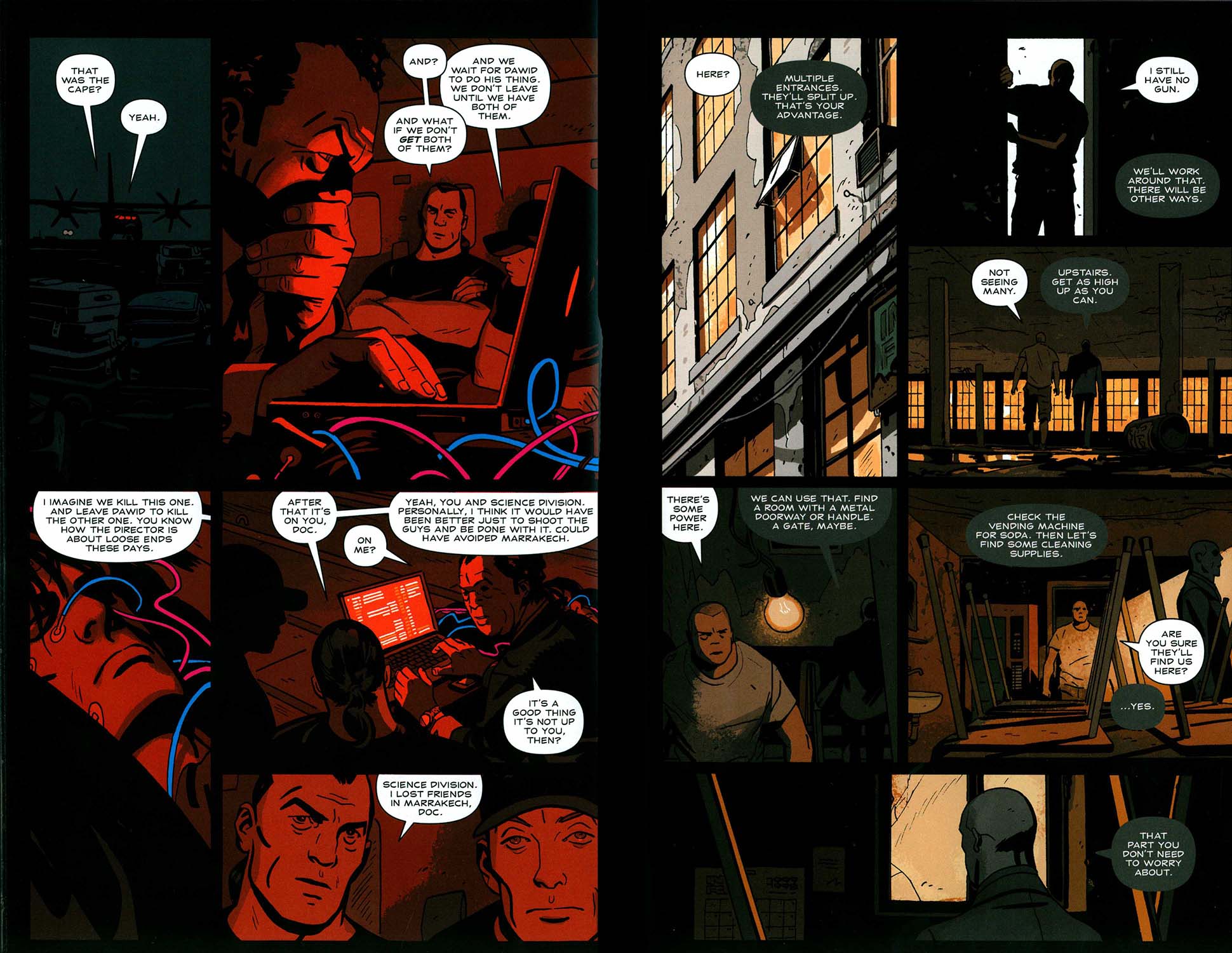
Brilliant drawing and coloring in Where is Jake Ellis #3
The reason why I want to do more Lobster books is precisely that—for the discipline and the basic skills. Not that I should compare myself to Moebius, but if it weren’t for all those Lt. Blueberry albums, there would be no Moebius.
The long term plan, of course, is to put all what I learn into personal work. Use those skills to do something new.
The Zero series was first brought to my attention when I was one of the Eisner judges this last year. The shifting styles of the visuals seemed at first to resemble the interchangable artist business of Heralds and exemplify what I most dislike in the current climate in mainstream comics: how artists are sidelined in favor of the promotion of writers as the “primary creative forces.” Ales Kot’s voice is consistent, but no single artist is apparently intrinsic to the book. However, with that book, on reading, the odd and purposeful shifting of artists comes to be seen as an unusual asset.
Zero has been planned from the start as that kind of series so it really benefits from it.
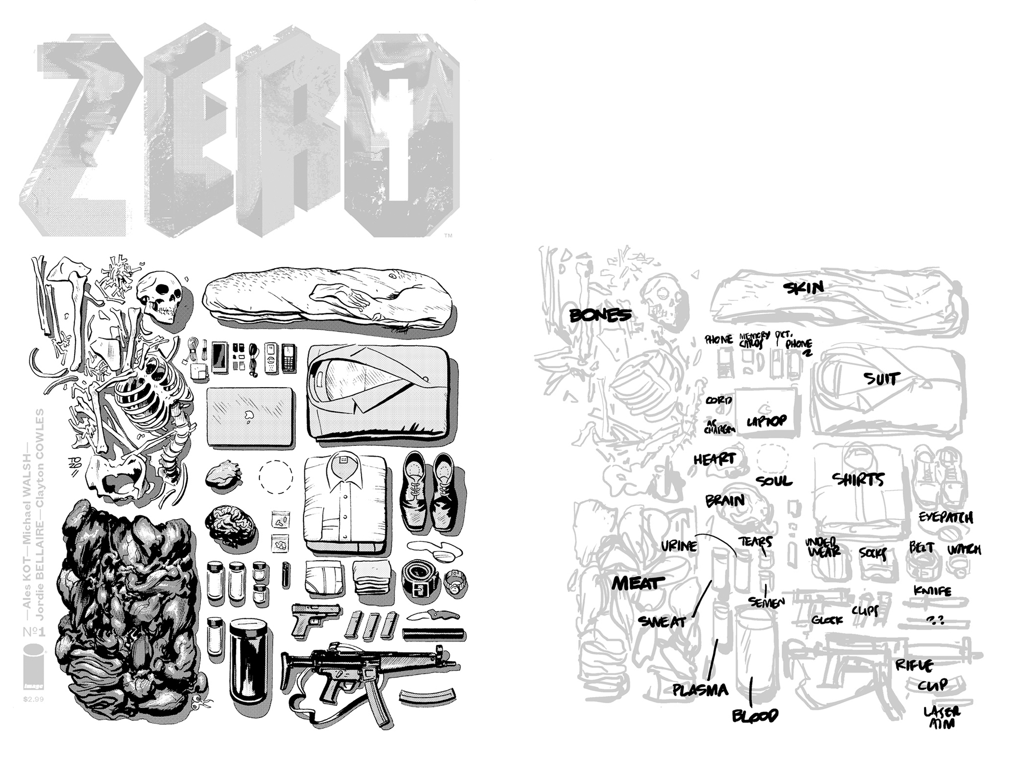
Just to clarify: in Zero, there are recurring motifs and page designs in the narrative about an assassin caught in a web of international intrigue, that touches on some very bizarre science fictional concepts–and it is fascinating to see how these structures, tropes and even identical page designs are drawn by the succeeding artists. The morphing vantage points clarify events that happen over the span of many years that the story encompasses.
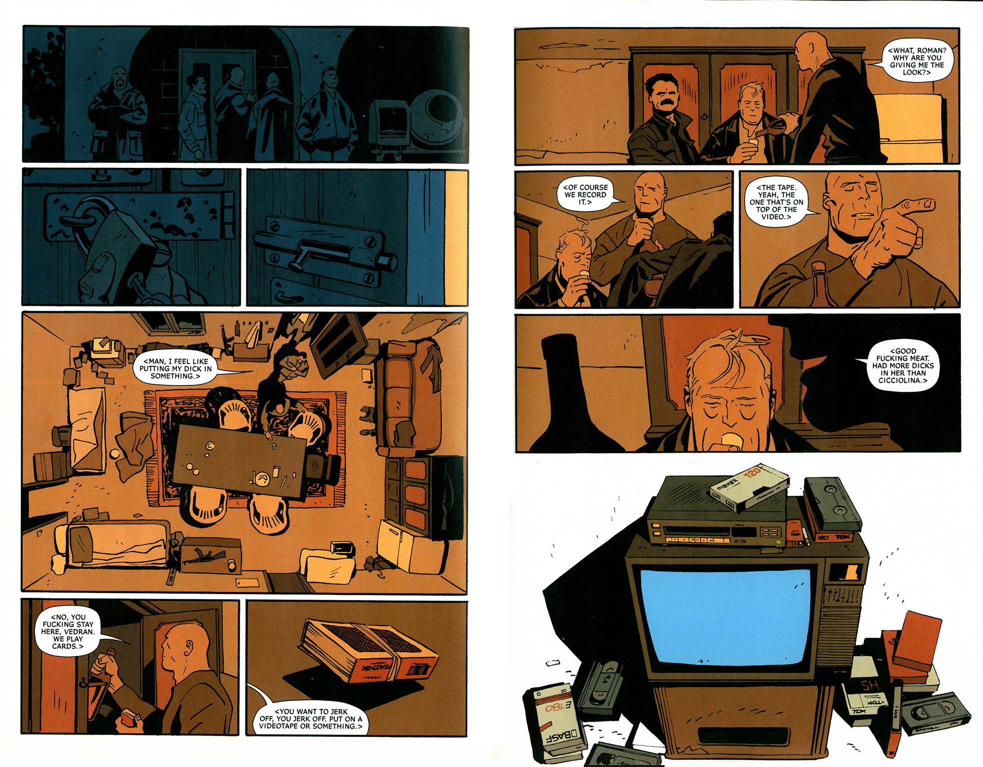
Not a fun party from Zero #9.
Now, did you study the earlier issues of the title before you did yours, and how much were you expected to adhere to what went before (or was brought to your attention that would be following, to be established by you)? How did you feel about working with Ales, who seems to have a pretty clear idea of what he is looking for? Or, how does working with him compare to working with other writers you have collaborated with?
I don’t remember any particular bits in Zero that had to refer to other issues. I had open hands on it, really… there were no requests to do it any specific way. I did read the previous issues, but didn’t make a point of studying them too much. I knew that for the look I wanted something deliberately crude – if there was more time I would’ve made it cruder. Rough, but not in any way cool. Unpleasant.
This script itself was somewhere between the old Marvel style and an almost-full script — some dialogue was there, and some images, but the majority of description was focused on the feeling of the scene, and all the panel breakdowns were left to me. So that was different than usual, which is working from a full script.
Generally I’d probably say that I prefer full script, because I find it easier to subtract and boil down. I never feel constrained by it — in the beginning it was hard, when I was trying to include everything that people would have in the script. Sometimes that’s physically impossible, as I learned the hard way.
Do you have any thoughts on the process involved in writing for yourself? I find it VERY challenging to write creatively; it is much more painful and time-consuming than drawing in some ways, for me. But, I’m coming to writing long after I have been working as an artist for many years…it isn’t a place of comfort and assurance for me. In fact, the best experience I have had writing is Post York, which forms in a largely improvisational drawing process.
I’ve only recently started to approach writing seriously. Until then, I’d written a few short stories – one for the Popgun anthology, one for the Madman special, and a few others for myself, and some for my friends. Other than that, a few unusable scripts, and ten times my weight in scraps and notes. Writing is much harder than drawing, but paradoxically it is also easier, and more fun. There’s more possibility of surprise too. I rarely get a drawing to appear out of nowhere – in writing it happens all the time. Even if I have an outline for the scene, things happen without me really doing anything. In drawing, you get happy accidents, but I’ve never accidentally drawn an unexpected major plot point.
Even on my personal work, I tend to write a full script, or at the very least, a detailed outline, with all the beats in place. Then I can thumbnail and figure out how to draw it. The other way around takes a lot longer, because you’re basically finishing the writing. It’s a whole other thing. And my theory is that this works best with people who write with thumbnails. I don’t do that because I find those lock me down too soon, and leave other options unexplored. I’d rather have an abstract beat than a thumbnail that suggests composition or direction. I find it hard to remove that first thumbnail from my brain, and try something completely different.
Also, writing with thumbnails results in longer stories, because it’s very easy to spend a whole page on movement or mood, without adding any story or information. Even three or four extra panels. It adds up. You see this happen when people move from animation to comics. They have no problem drawing a lot (unlike comics people) so they easily end up with fat books that are somehow very light on story.
Along the lines of your guides for the Lobster work, did you indicate to Zero #9’s colorist, the excellent Jordie Bellaire, that parts of pages 4 and 9 should be run as a lighter tone and did you provide a guide for the blood on the baby on page 24?
The colors were pretty much all Jordie. I didn’t provide the guide for blood since the baby was supposed to be covered with it, but I did send a few suggestions regarding lighting on some other pages. There was a sequence where a cloud casts a shadow on the character that didn’t really work out as clearly as I hoped it would. Since the book did have a set coloring approach, I tried to ink a bit differently.
The cover is particularly effective. It makes me think of a more political Chris Ware.
I love Chris Ware —I’m not sure I’d like a political Chris Ware, though. It sounds like a recipe for disaster. In any case, on Zero, I was originally supposed to do a different issue, and I did a cover for that one before we swapped out the issues.
Line art for Tonci’s other Zero cover, for #14
However, that cover had the same approach — I simply didn’t want to have a big picture of the main character. I tried, but it didn’t make sense at all. So I thought about other ways of showing the character.
For the cover for #9, Ales had sent some photographs he liked, which were too specific to use without basically duplicating them, but they got me thinking about buildings. That is definitely a thing I have seen throughout my childhood, buildings with holes in them, years after the war. And it’s a powerful image. I did my best to present it as plainly as I could, and was very happy with the response it got. So much for audience always wanting loud, ‘dynamic’ stuff.
Adding the stages of deterioration came as a logical next step, and Ales suggested the debris forming Zizek’s face on the last one.
The wraparound cover for Zero #9
I hadn’t even noticed that until you just pointed it out—but there it is! That cover is beautifully realized. It makes very visible the point of the story, that the arms dealer protagonist sells very powerful weaponry to anyone who will pay him, to all the various opposing forces to use against each other in fact. The cover shows clearly the effects of what he does on human habitation.
How much did the local wars impact you as you grew up? The cover and story certainly seem informed by the history of conflicts in your country.
I was five, six years old during the worst parts – just started elementary school. We had to move back to my parents’ hometown halfway through my first year of school because the war was getting too close. But, it’s scarier in retrospect than while it was going on. As a kid you don’t really understand what is going on. I suppose having to run down into the basement because of air raids and hearing the neighbor’s house blow up had to have some effect. But it’s not something that I think of that often.
How much “scrap” or reference, or perhaps work with live models do you use? Your work seems entirely believable and accurate in terms of location, architecture, clothing, vehicles, etc. Note that I think it is very difficult to accomplish some higher levels of accuracy and believability in realistic/adventure-oriented comics without careful observation or using reference. On the other hand, one doesn’t want to use photos very directly because they deaden the work.
The first issue of Lobster was the toughest, since I had to look up literally everything, and Zero was the easiest, because I could put in all the things that I know like the back of my hand – cement mixers (that were everywhere), unfinished villas, cars, old books that everyone had in their house at some point in the eighties, and so on.
Usually I look at photographs, videos, if there are any, to get a sense of the place and time. I try to soak it in, and get a feeling for it. I sketch, but not nearly enough. As a rule I amass much more reference than I can really use, so I end up inventing something even though I have four hundred photos in some folder. I am making an effort in that area, but I wish I could have the patience you see in those French albums, where people really push to make it all accurate.
To be fair, for those European albums, the authors used to take a year to draw 64 pages. In America, we have always been expected to produce many more pages, a lot faster.
The accuracy is not just in the stiff historical stuff — or in Largo Winch, where Francq would travel to another country to take reference photographs — Franquin is my favorite when it comes to specificity. Then again, there’s a weird area that works in comics, where you’re drawing, say, a car, and it’s clearly an old car, but not any specific old car – a 1934 Pierce Arrow sedan, for an example – and you’re basically drawing a ‘feeling’ of an old car. It’s weird, but comics can live in this area. People really respond to it. I’m sure that’s what people respond to in my comics, since I rarely draw anything accurately.
Zonjic and Stewart’s elegant pages from Get the Lobster #2
I don’t use live models, or take reference photos for figures. I should probably do it, because sometimes you can tell that I’m just guessing, or I take two hours figuring out some pose, and in that regard it would just be smart. I’m afraid that if I started using photos for that, I’d end up never working those muscles.
It would also add another step and another layer of gadgets to the process of making the finished page, and there are too many steps already, what with the digital layouts and all. It becomes tedious, and I’d rather try to move in the other direction, and boil it down back to just paper and pencil (and ink).
It’s very easy to make the process more complicated.
How is it to draw not only a country you don’t live in, like the USA, but also in the case of the Lobster books, an era before your time? I ask because for my work, I find I have to be able to get a solid sense of what I’m drawing…for my new book The Late Child, it helped that I had spent time where my wife Marguerite the writer had grown up in Portsmouth, England and parts of France. When I did Aaron and Ahmed it was very hard to get a feel for the locales—I have never been to Pakistan, for instance and had to rely on such second-hand reference as videos I watched online by VICE of the gun market near the Khyber Pass. Any lack of certainty that the artist has in the material is transmitted quite clearly to the reader and so I imagine that you must have been to America and researched the periods depicted in your work.
It’s tough! It’s great that it feels like that to you. This is again that drawing of a feeling I mentioned earlier. I’ve only been to North America once, for a short while, before moving to Canada. I vividly remember just how much of a difference it was, back then. We see North America on TV and in movies all the time, but it was still a big shock. That did influence it a bit. Now that I live here, it will influence it much more. Now I want to get it right. I have big plans. Maybe it really would be the best to get on a plane and at least spend at least a weekend someplace. What you write for Pakistan, I totally understand it. And, it’d be so easy to find only the interesting pictures online. You get the landmarks and the nice vistas, and you get the worst parts, maybe. I spend a lot of time trying to find the mundane, in-between parts. Things people wouldn’t bother to take pictures of. So the best reference I find is very often in the backgrounds of someone’s vacation album, something behind their smiling spouse in the foreground.
I like your art on the Lobster Johnson comics very much—I can see you put a lot of effort in and there are some great and effective passages throughout—-and I do like John Arcudi, I’ve been talking to him for a few years online and we met once in Philly—he’s a great guy and a strong horror writer. And overall I quite like the Hellboy titles. But the stories of those are a bit less engaging to me than the content of the Zero you did and the two Jake Ellis series. I prefer to see comics that are about something more than just light entertainment, or that at least deal with real world issues.
I get what you mean. As someone often paralyzed by the need for meaning, comics are a tough field. I don’t read much, I don’t connect with much. A lot of it is unsatisfying for adults (and so are most movies).
I have grown to enjoy genre stuff a lot more. John (Arcudi) often plays the long game in these books, and it was good that the first contact I had with it was reading ten collected trade paperbacks. Seeing it all connect, it was very impressive. In the end, I don’t expect any deep personal meaning from those books, or any other, for that matter, until I write something of my own.
We talked earlier in our e-mails about these things, and I mentioned that it feels like there’s a gap in the middle of comics — simple, “normal” stories, drawn realistically. Outside of Jaime Hernandez’s Love & Rockets stories, or things like R. Kikuo Johnson’s Night Fisher, there aren’t many of them. Probably because it takes a lot of effort and skill to create somewhat less noticable comics. And they’re not really all that simple in the end. But I often wonder why people don’t aim for that. Whenever anyone does it well, like Glyn Dillon did recently, everybody goes nuts! That would be an interesting field to explore.
I admire the page you did on your blog of different visualizations of the pain of headaches. It makes me wonder if you get migraines—ugh. It points to the fact that comics, or the sort of ways of thinking that doing comics engages, can express all sorts of things, some yet-undreamed of. We can express information in innovative ways that connect directly to the viewer.
I actually do get headaches and migraines, but not as much as I used to. The headaches page was inspired by one of the recent ones. I’m not sure I’d call it comics… maybe. It’d be much more abstract than I go for. Yet that’s what’s fun about short comics. No characters, no plot, and no time? Sure. If it doesn’t work, you haven’t wasted a month, and the reader hasn’t wasted more than a minute. I think for every one like this that I come up with, I come up with another that’s all plot.
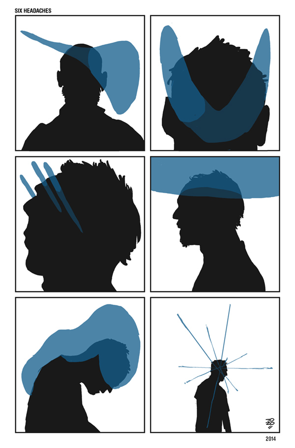
“Six Headaches” by Tonci Zonjic from his blog
First published on The Comics Journal


